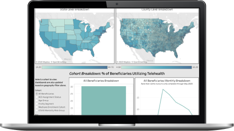
This dashboard leverages the 100% Medicare fee-for-service claims database.
How does CareJourney define strong vs loosely aligned?
CareJourney developed this definition in partnership with one of its members as a means to indicate whether a majority of your Primary Care Spend was attributed to your primary care provider. The measure can be used as a good proxy as to whether the patient is well aligned to their attributed provider.
Why do the strongly and loosely aligned numbers not match up to the alignment graph?
All of this information is cut at the NPI level and then summed up for the purposes of this dashboard. Due to cell size loss, some data might be missing but gives a view, directionally, of whether or not the DCE has significant risk of churn out.
What other cuts of the churn data are available?
CareJourney can also flag which benes churned out due to death vs those that churned out and were aligned to someone else.
How can I see my DCE's data?
Please reach out to CareJourney to learn more!
"There was a lot of collaboration in creating this packet of market analytics, looking at which metrics would make the most sense to track. CareJourney’s process of pulling this data into a multi-layered, visual user interface replaces the manual effort previously required by our analytics team."
Mallory Cary, ACO Operations DirectorWe have a large library of similar JumpStart data and custom analysis with in-depth commentary and insights on various healthcare topics.
Get access to more JumpStart dashboards to see how impactful our dataset is and what it can do to inform strategic business decisions for your organization.
CareJourney is a leading provider of clinically relevant analytics for value-based networks supporting leading payer, provider, & life sciences organizations.
Learn more about how we help organizations achieve their goals by bringing new, high-value insights out of expansive population claims data.